

1. Research
The project began with an analysis of similar case studies. We reviewed websites of other pastry shops and related brands, identifying strengths and weaknesses to better understand how the industry presents itself online and which visual and narrative approaches are most effective.
2. Concept
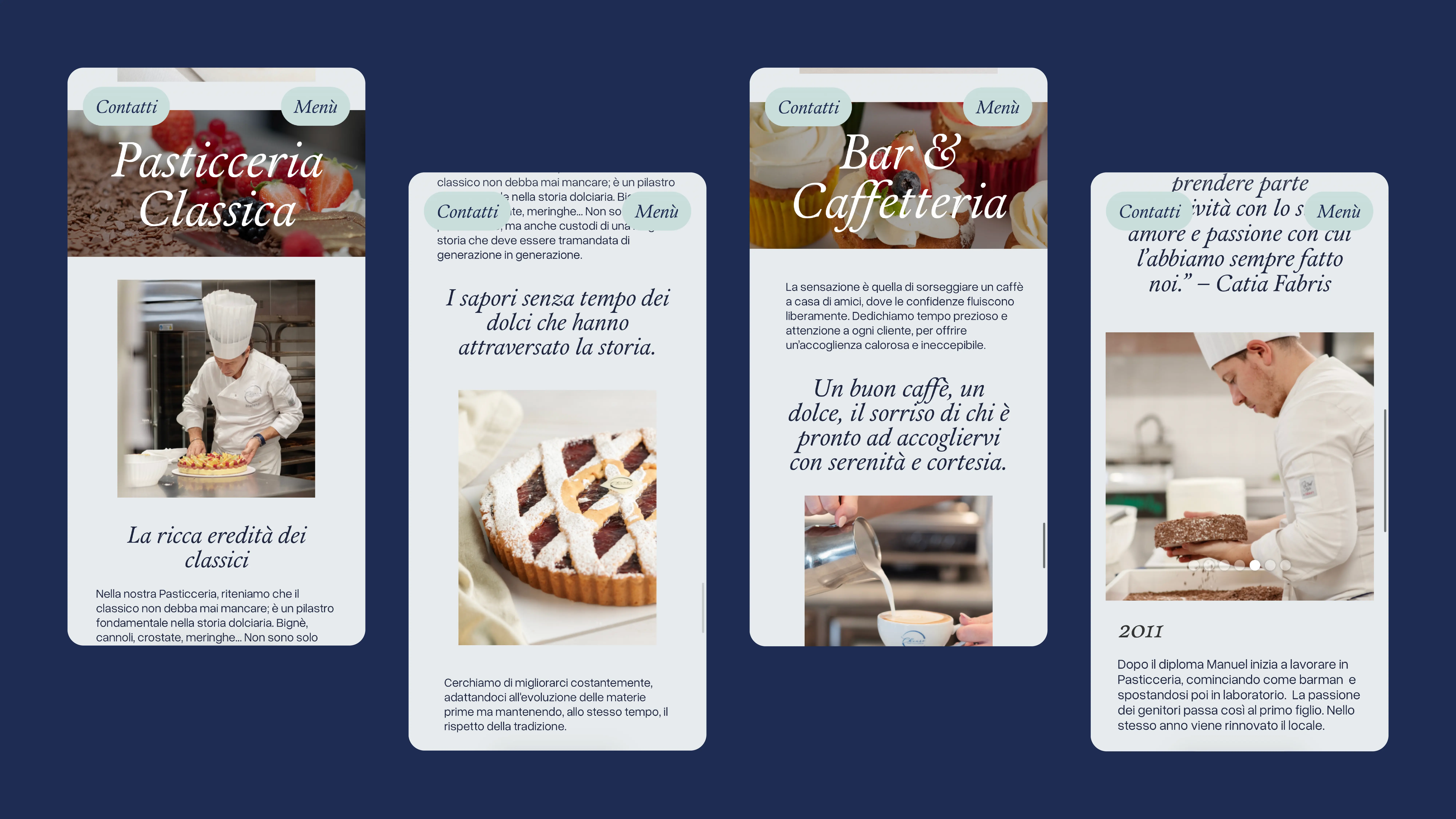
Following the research phase and discussions with the pastry shop’s marketing manager, we structured the website around two main pillars: on one side, a focus on the different types of pastry that Chiaro specializes in, highlighted on the homepage; on the other, a section dedicated to contacts and the brand’s story, which tells the family project that lies at the core of the business.
3. Design
The project evolved through several stages: wireframes, visual identity, and finally development in Webflow. The soft color palette is inspired by the interior of the pastry shop, creating continuity between the physical and digital spaces. The open-source serif typeface reflects a sense of elegance, tradition, and professionalism. The site is easy to navigate through a simple main menu and remains compact thanks to its two-page structure.
4. Art Direction
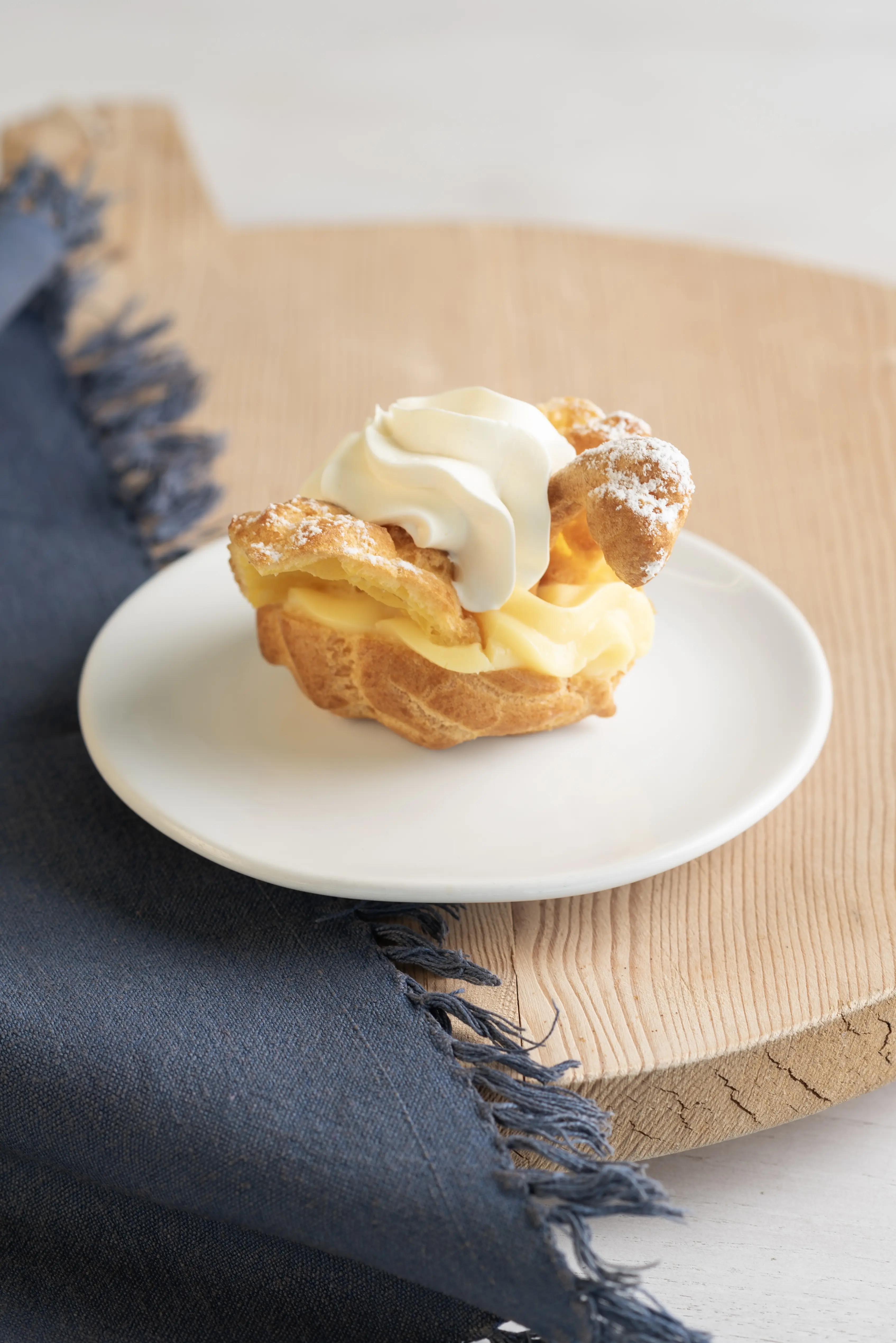
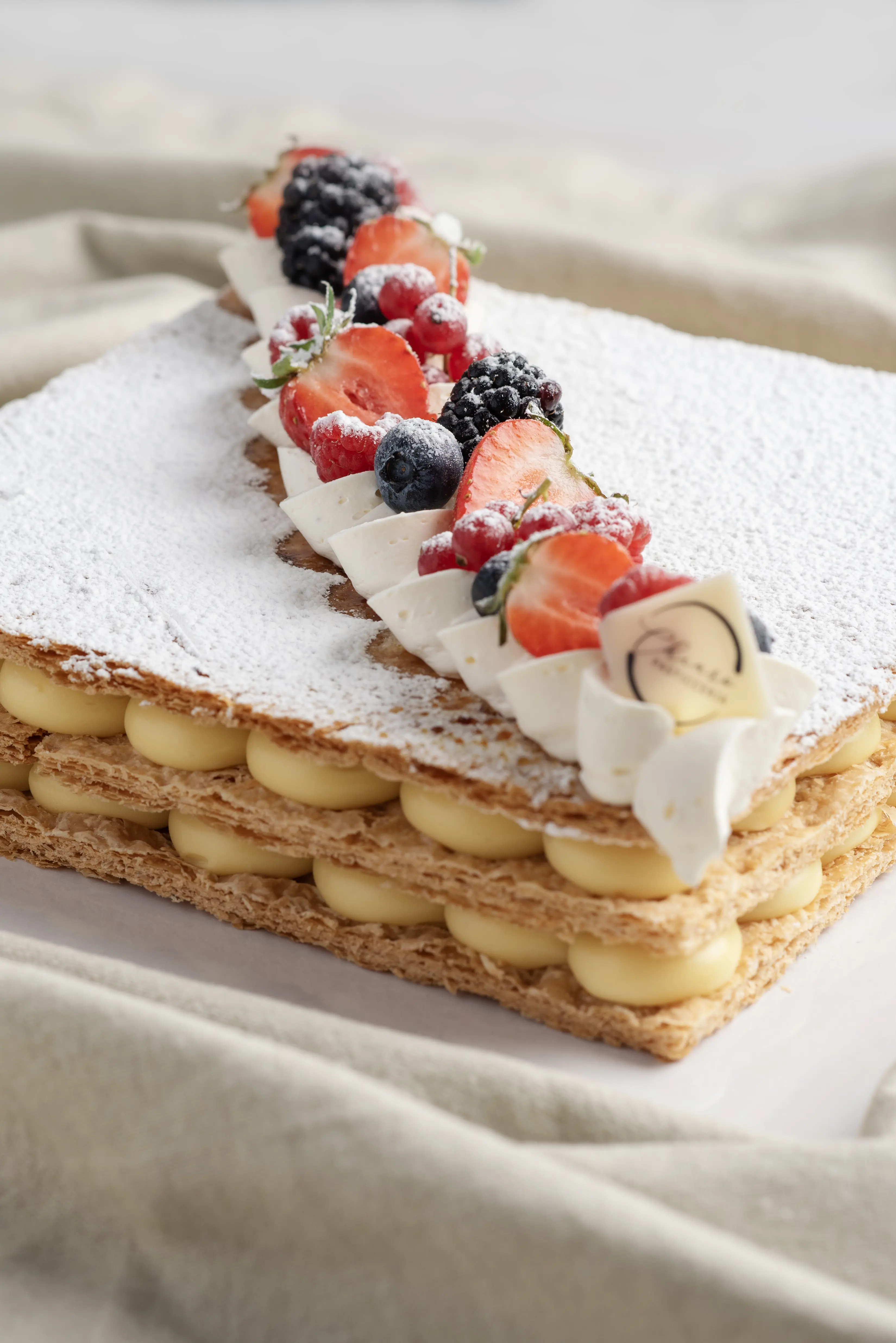
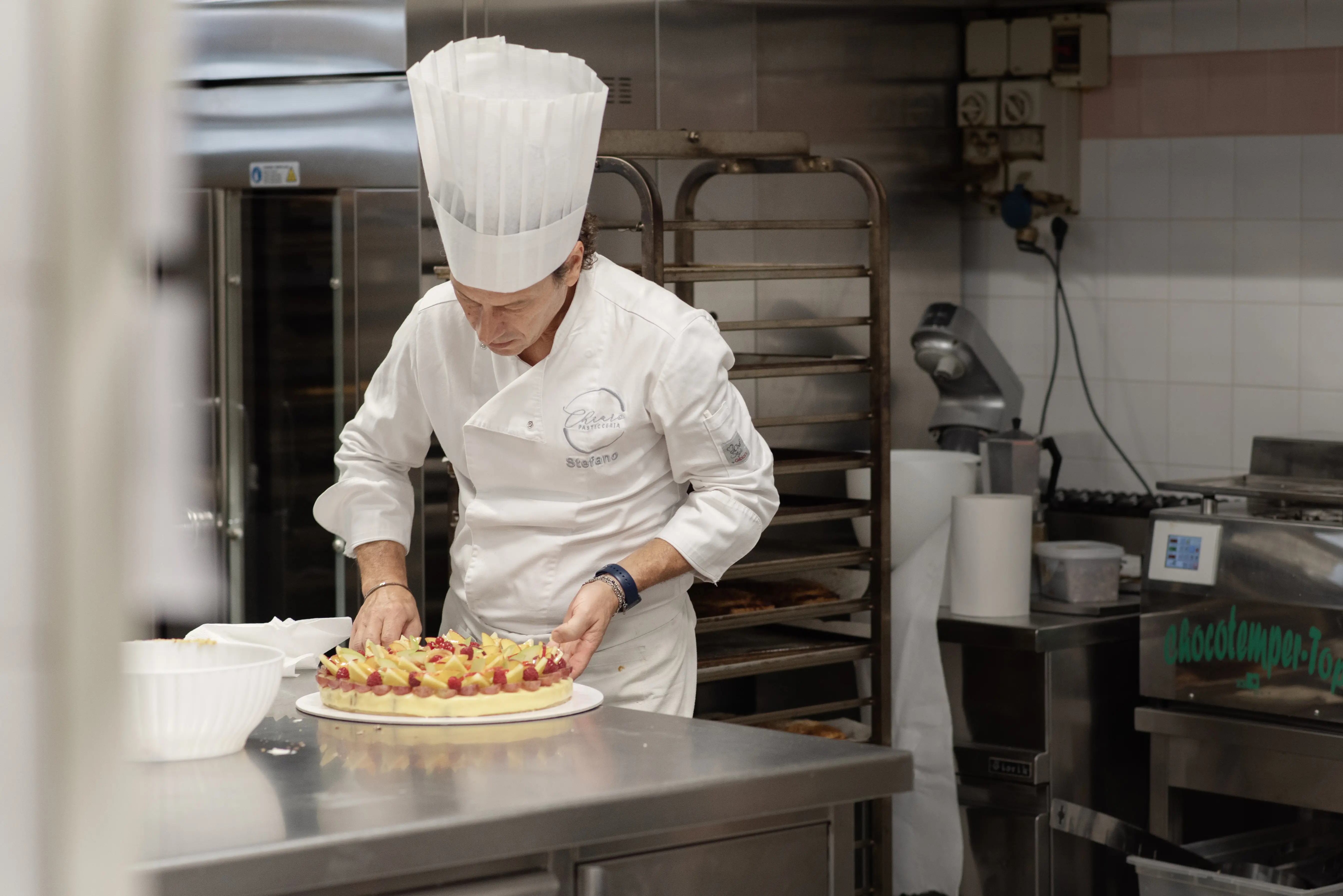
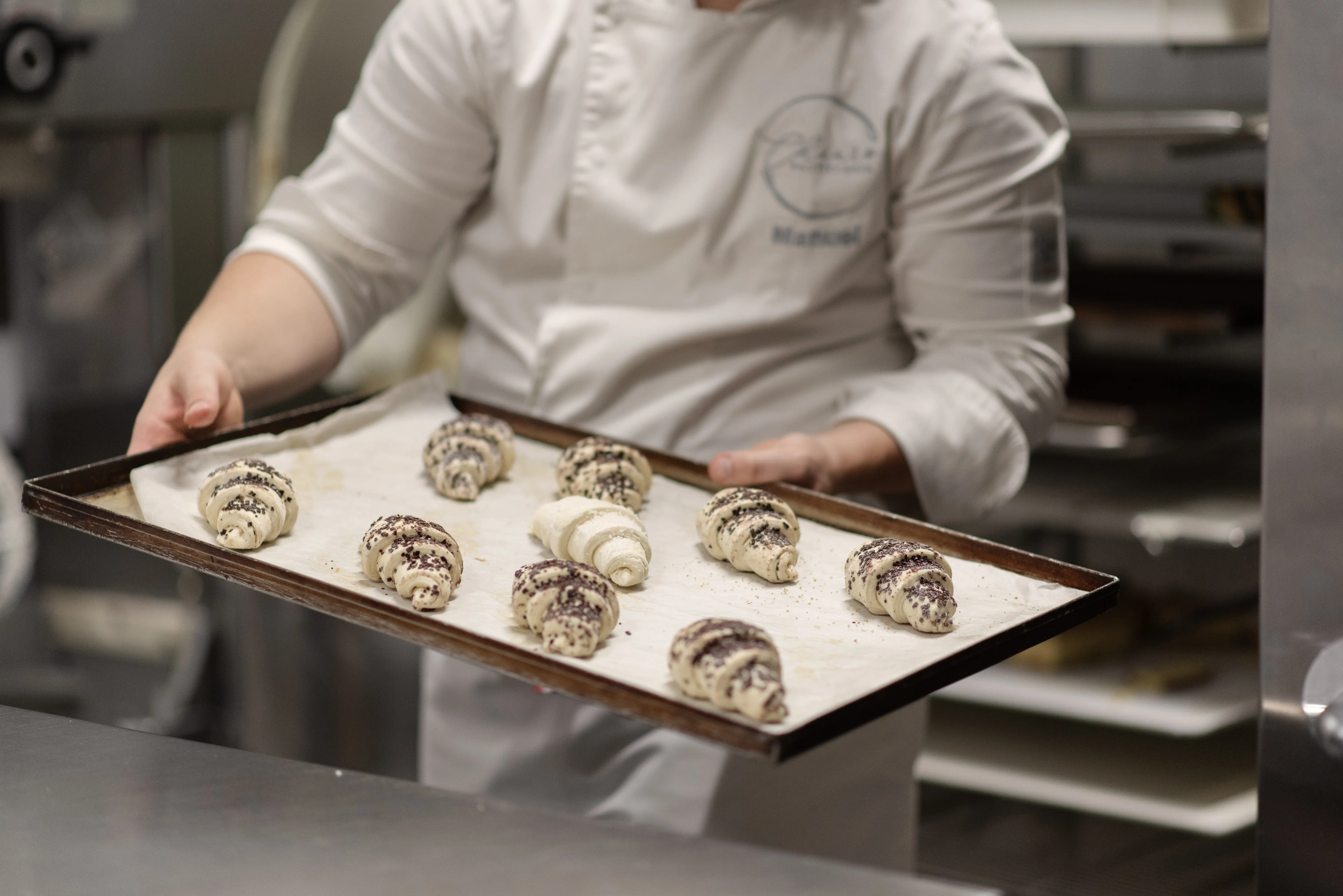
For the art direction, we collaborated with photographer Diletta Bisetto, producing a photoshoot directly inside the pastry shop. The resulting images authentically showcase both the products and the people behind them, helping convey the high aesthetic and quality standards of the brand.
The homepage video, a montage of short stock clips, immediately immerses visitors in the world of pastry making, enhancing the overall visual and emotional experience of the site.
