1. Research
We conducted research into how video creators, producers, and film studios present themselves through their websites, focusing on structure, visual language, and the role of motion and imagery.
2. Concept
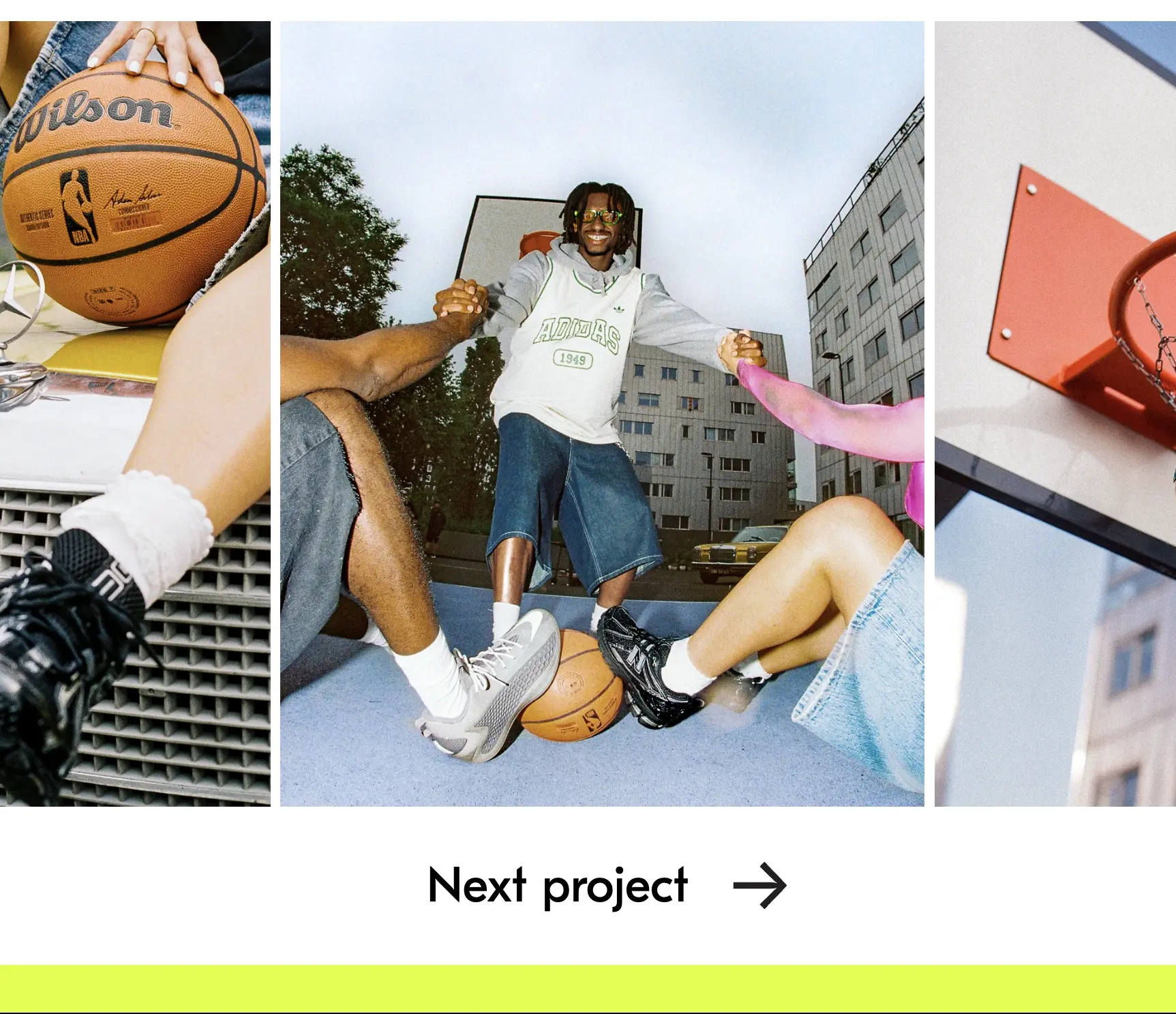
The visual identity is directly informed by the name Mossquitos. The logo is intentionally pungent and distinctive, with the letter q placed at its center, the only non-italic character in the word. The q was customized to evoke something stingy and sharp, echoing the impact of the videos themselves: unforgettable and memorable.The color palette is largely drawn from the videos, which are visually rich by nature. A single brand color, a fresh lime green, is used throughout the identity, adding contrast and reinforcing a sporty, energetic tone that reflects their body of work.
3. Design
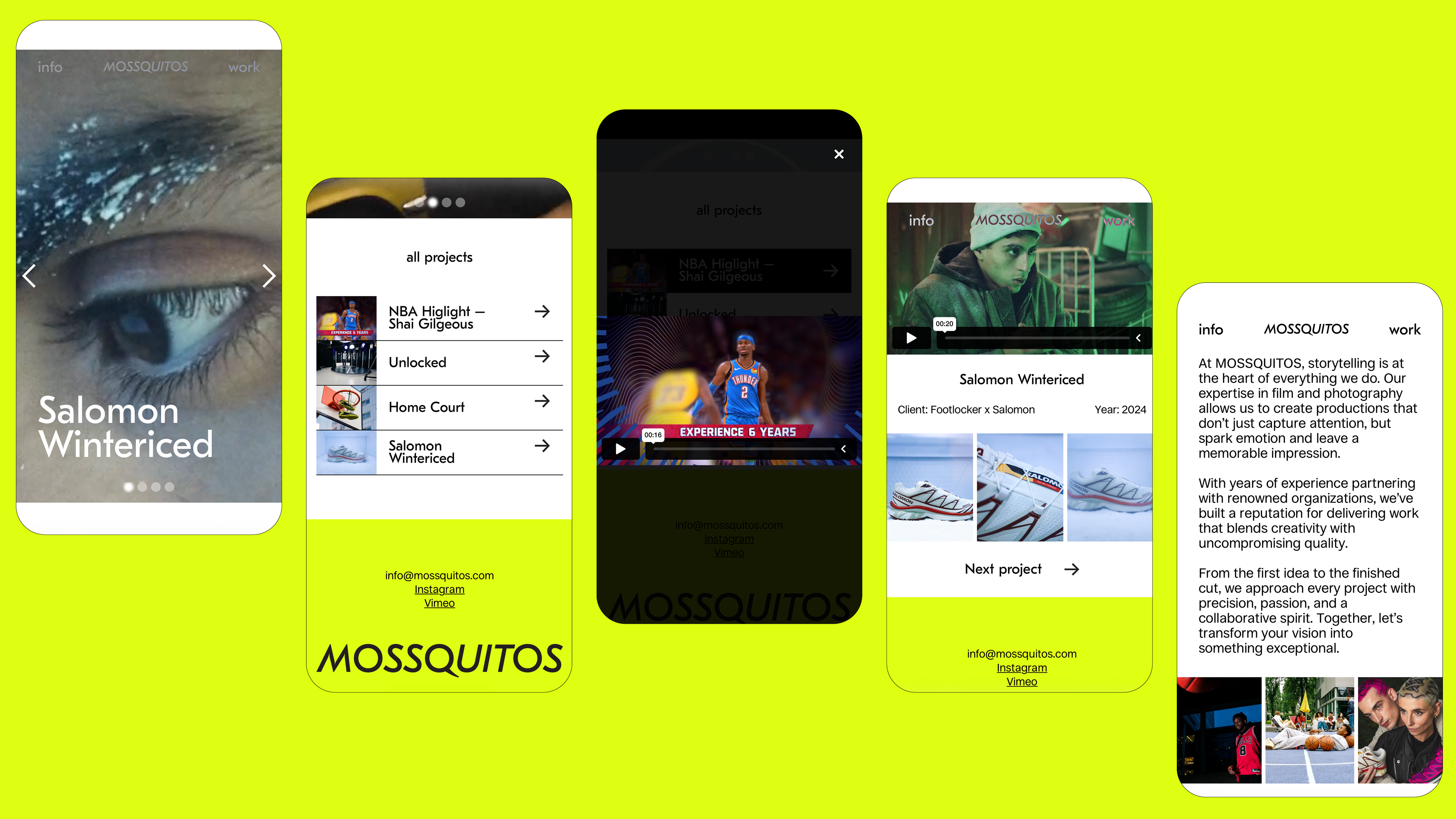
The website was designed in Figma and developed in Webflow. It is intentionally minimal, with a limited number of pages and a strong emphasis on video and imagery. Visuals are always presented large and full-screen.A subtle blur effect is applied to text buttons on hover, referencing the act of focusing through a camera lens. Headings use the custom logo typeface, while the body text is set in an open-source sans-serif font for clarity and balance.