1. Research
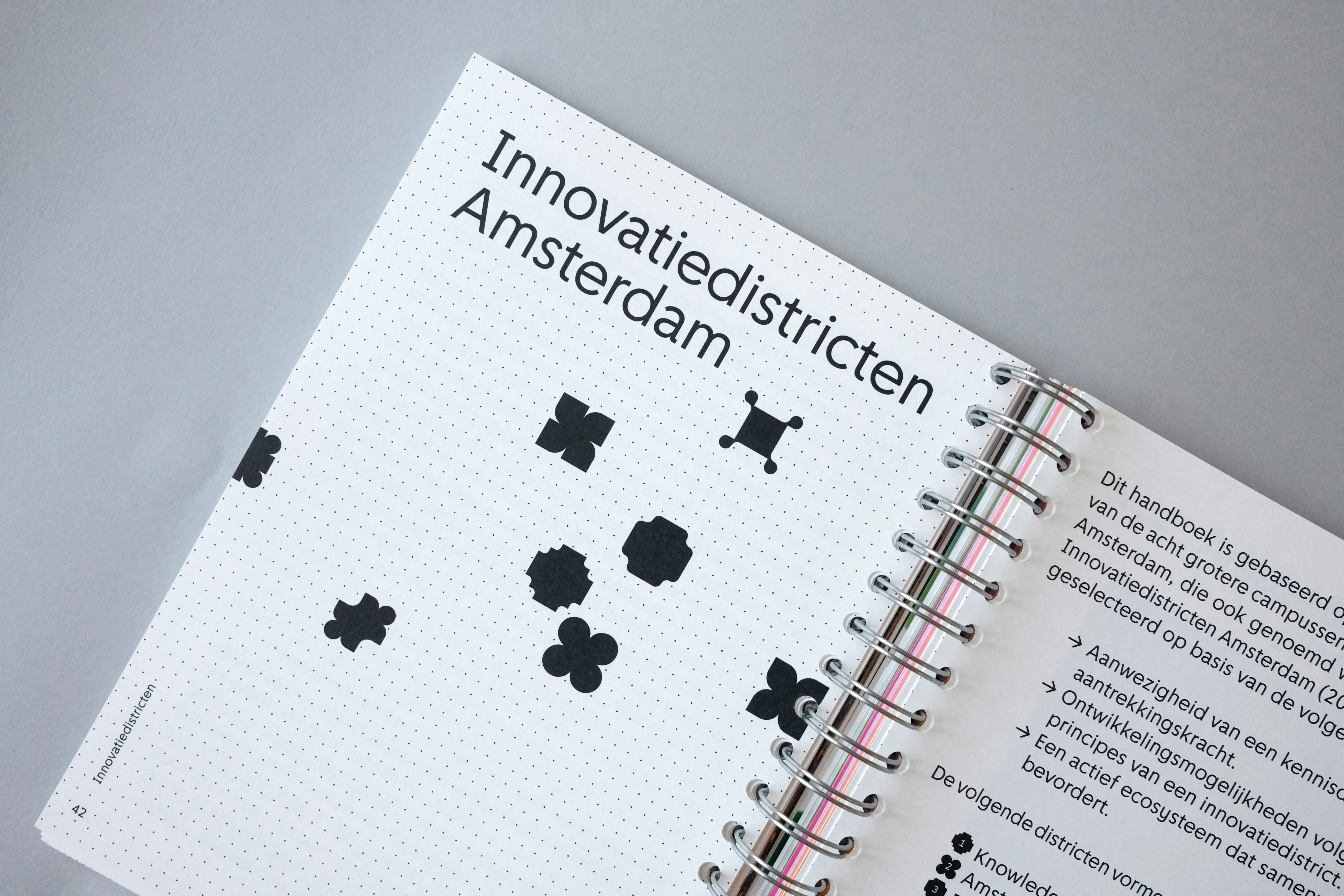
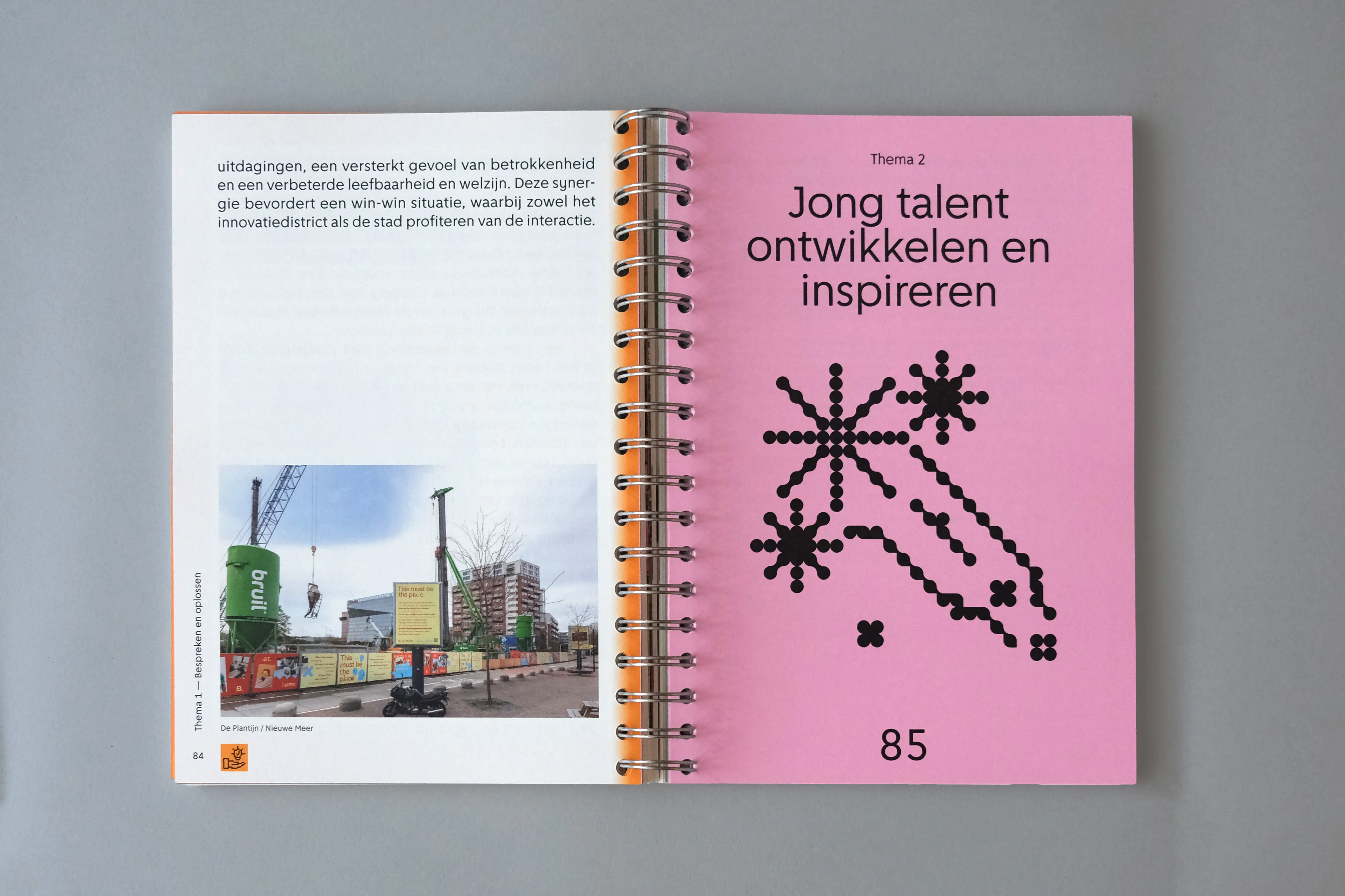
Our research began with the idea of visualizing how innovation districts can foster community, collaboration, and social interaction. A key reference was the work of Daniel Eatock, whose signature dot-based visuals inspired our approach in illustrating how these districts spread and strengthen connections among citizens.
2. Concept
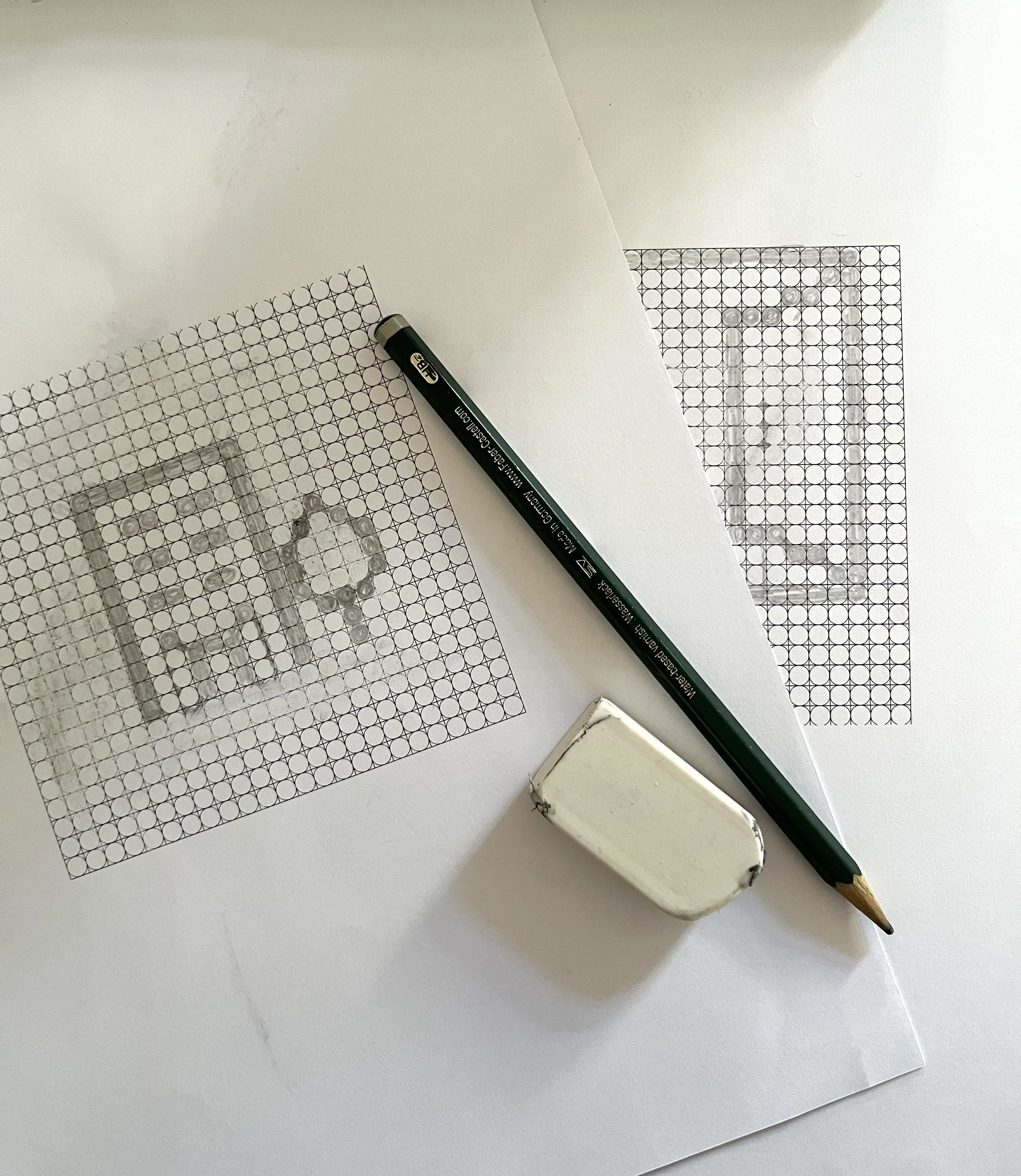
From this starting point, we chose to carry the motif of the dot throughout the entire book, adapting it in different ways. The opening pages introduce the theme in a poetic, gradual progression, with dots increasing in number and scale. In the theoretical chapters, the dot grid becomes a structural device that zooms in further with each chapter, symbolizing the deepening of the analysis and a closer examination of the subject matter.
3. Design
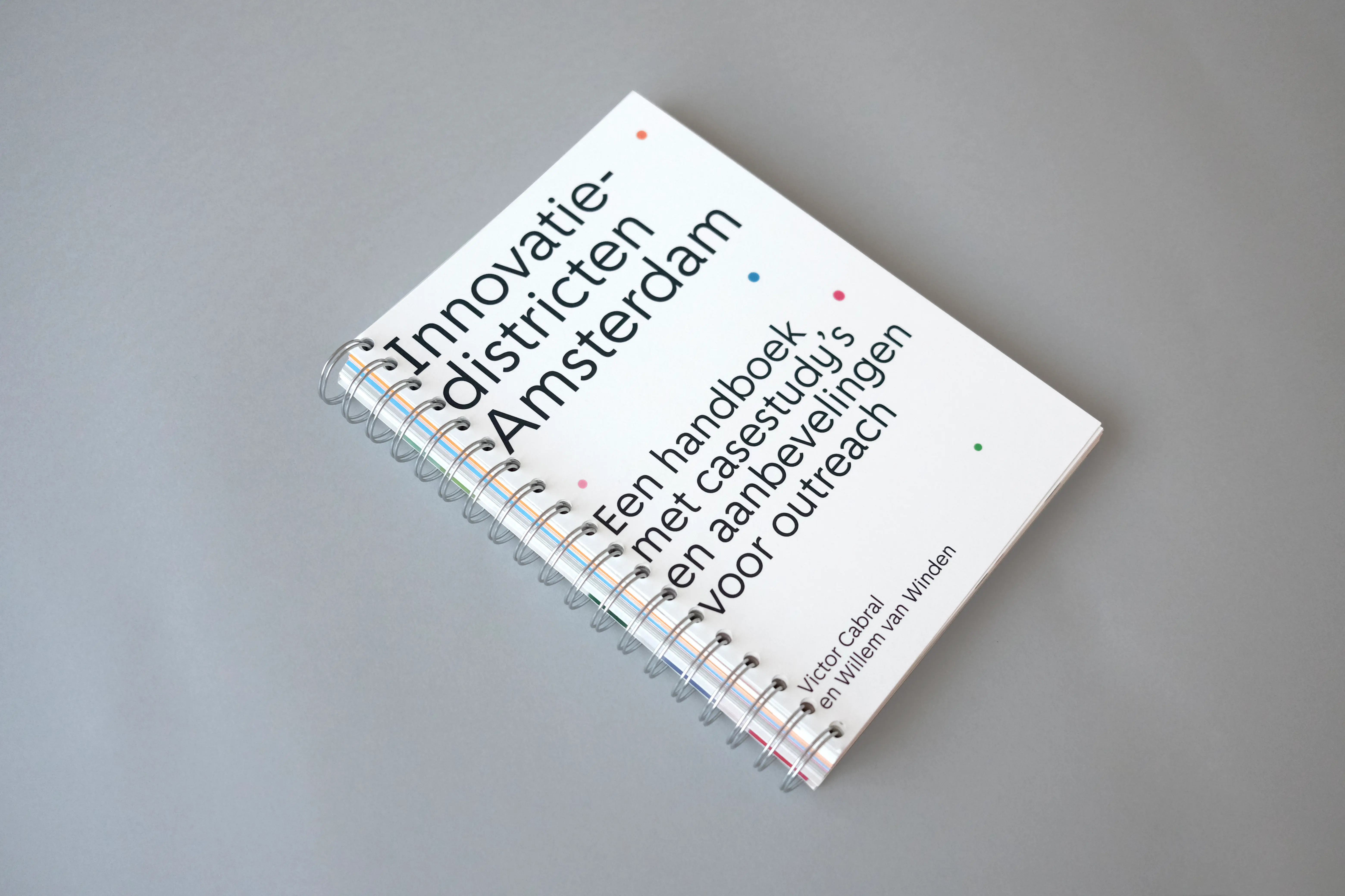
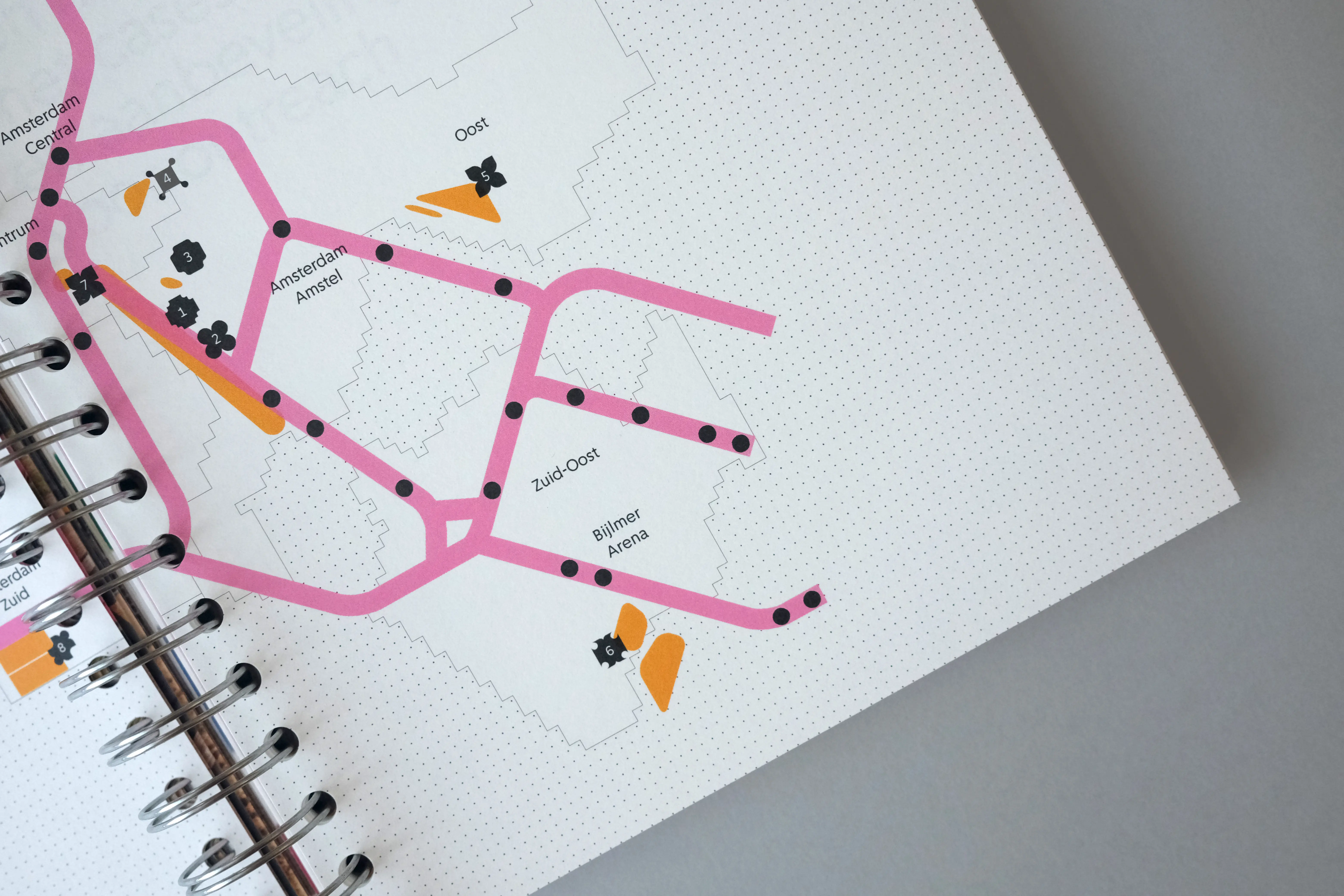
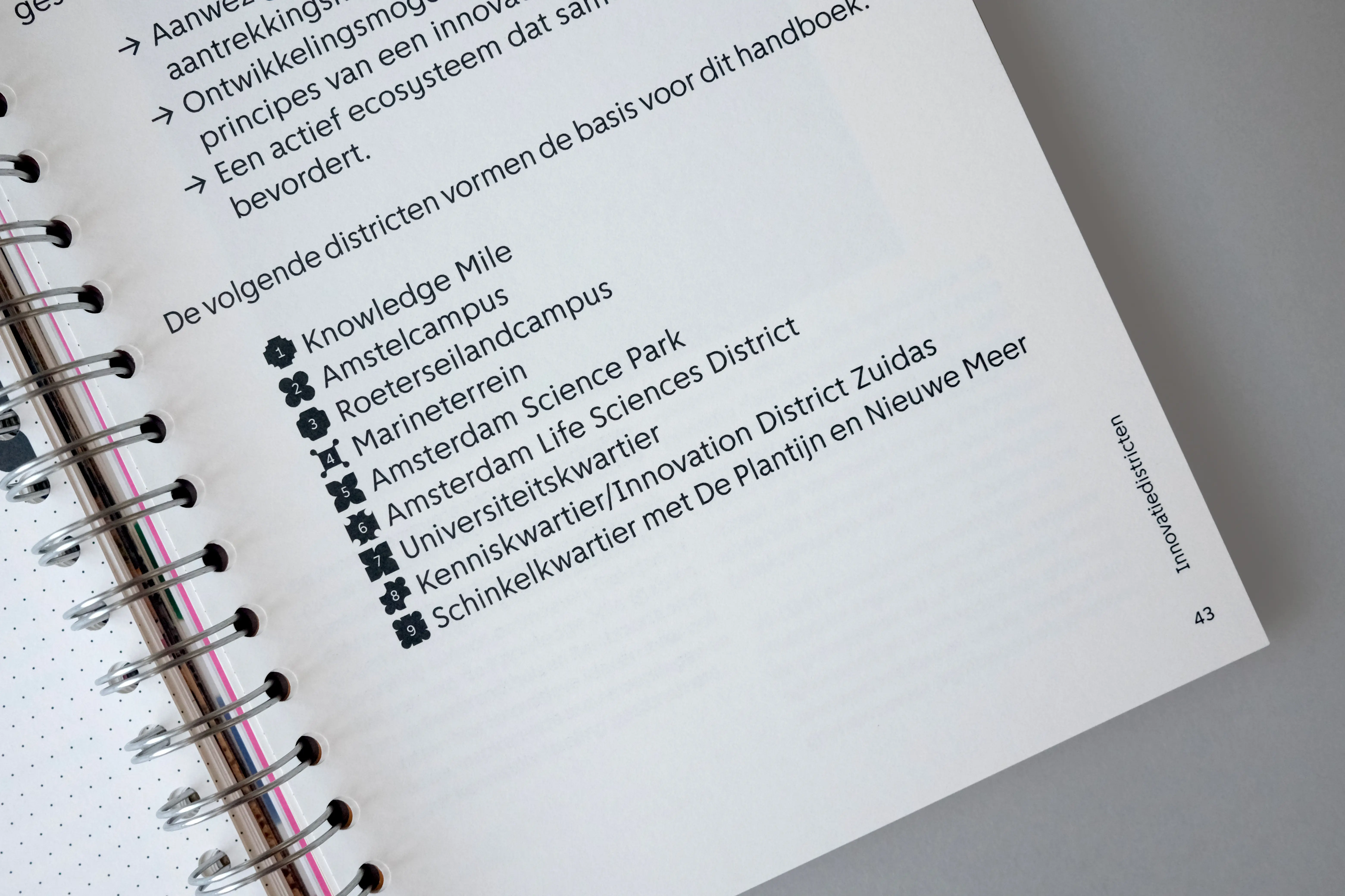
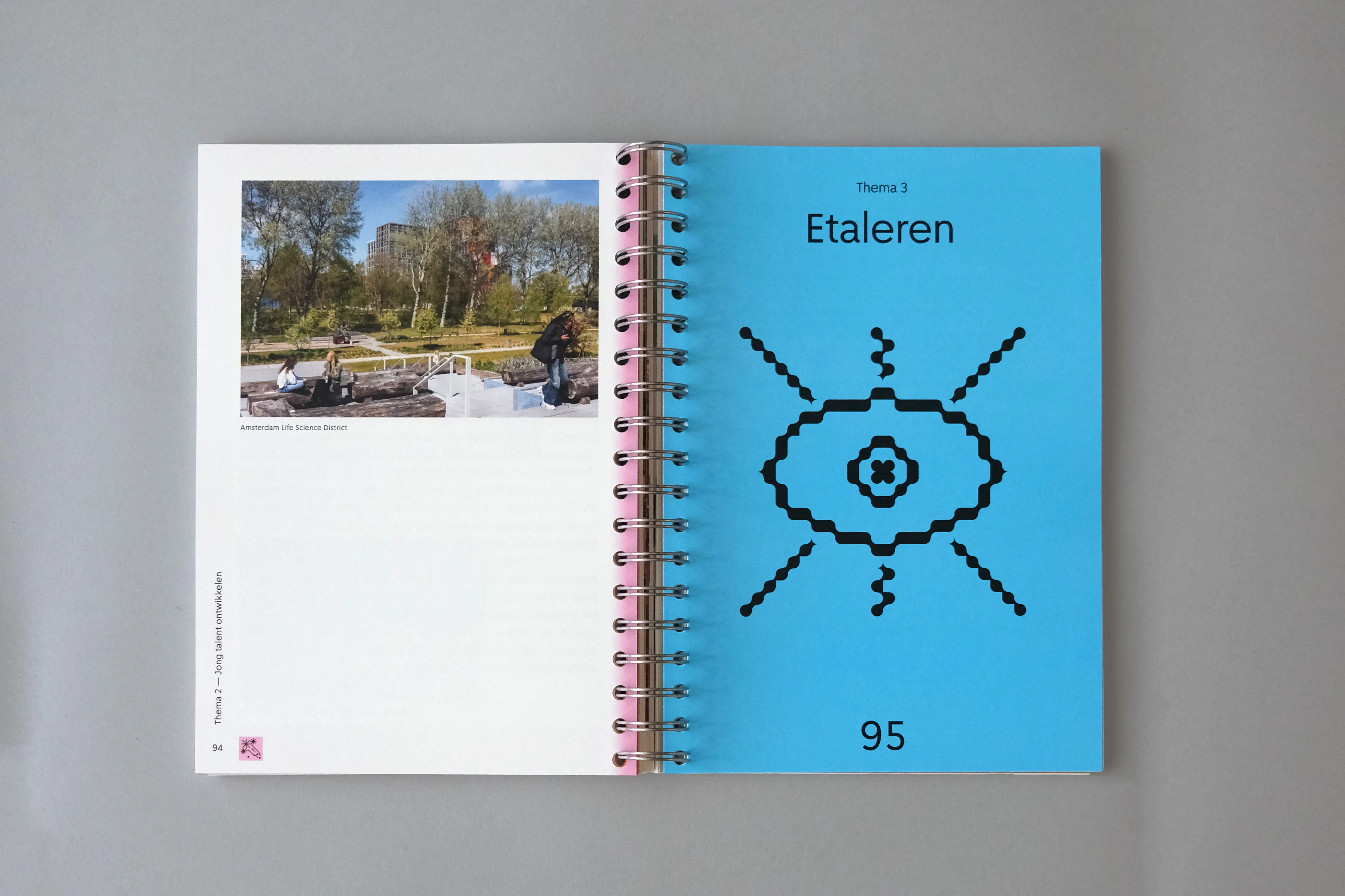
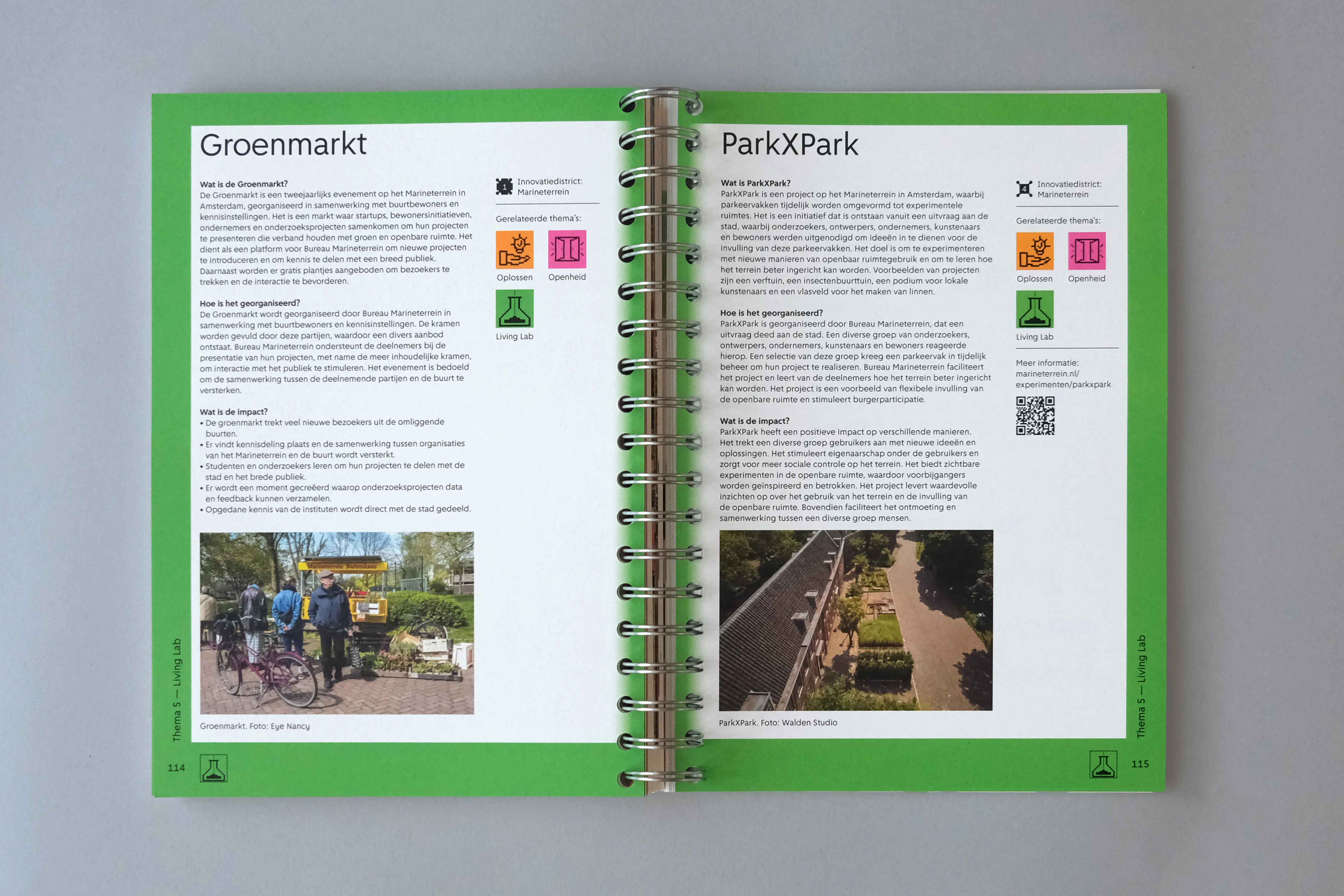
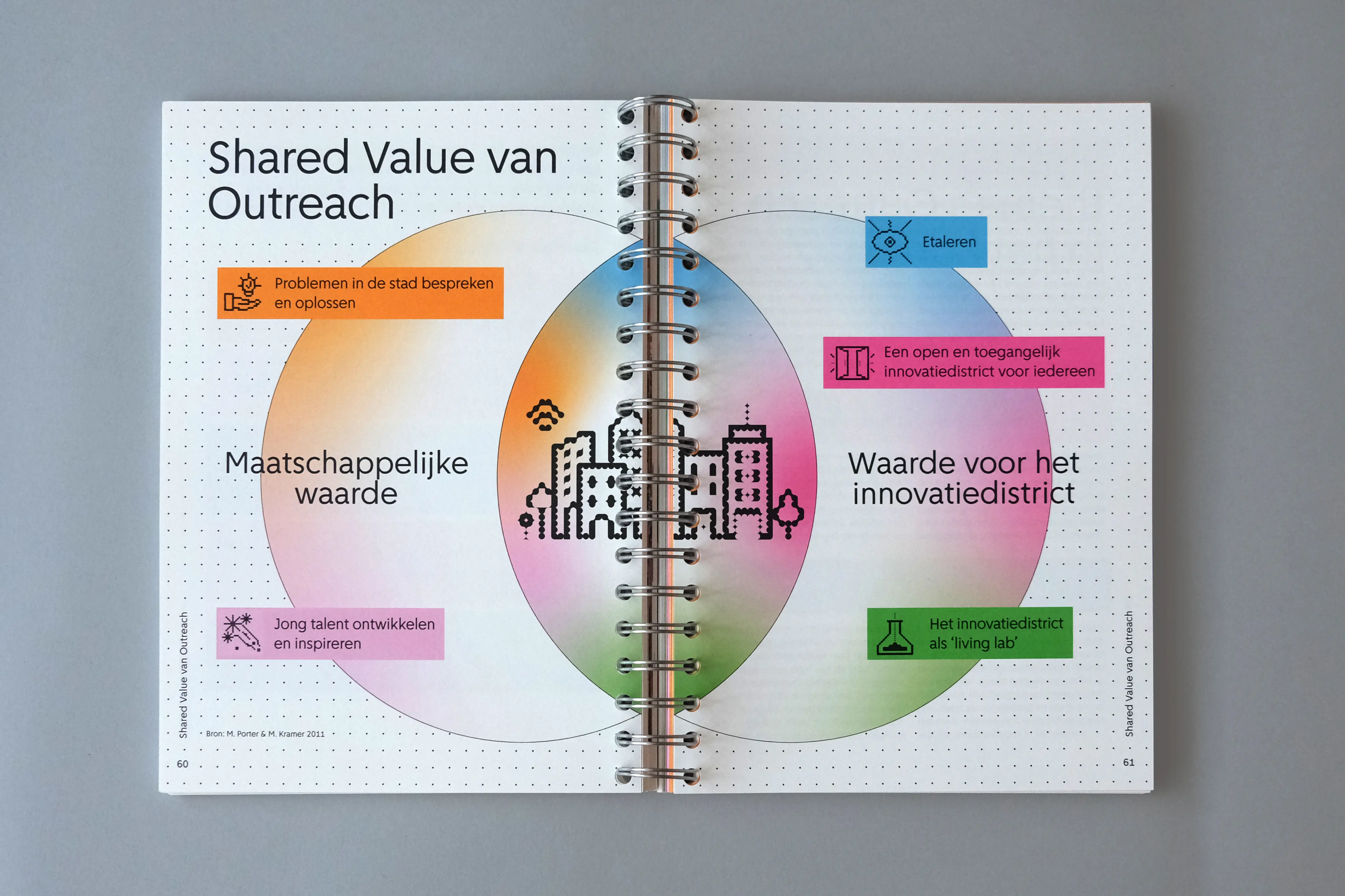
The grid acts as a recurring visual framework. From decorative chapter openings, it evolves into a more defined structure (consisting of overlapping circles and squares) used to design icons that visually summarize each theme. Every topic is assigned a specific color, and case studies are marked by a matching colored frame. We worked with a single typeface, Amsterdam Sans, reflecting the book’s focus on the city and its people. The manual-like feeling of the project informed our material choices, leading to the use of spiral binding.
4. Art Direction
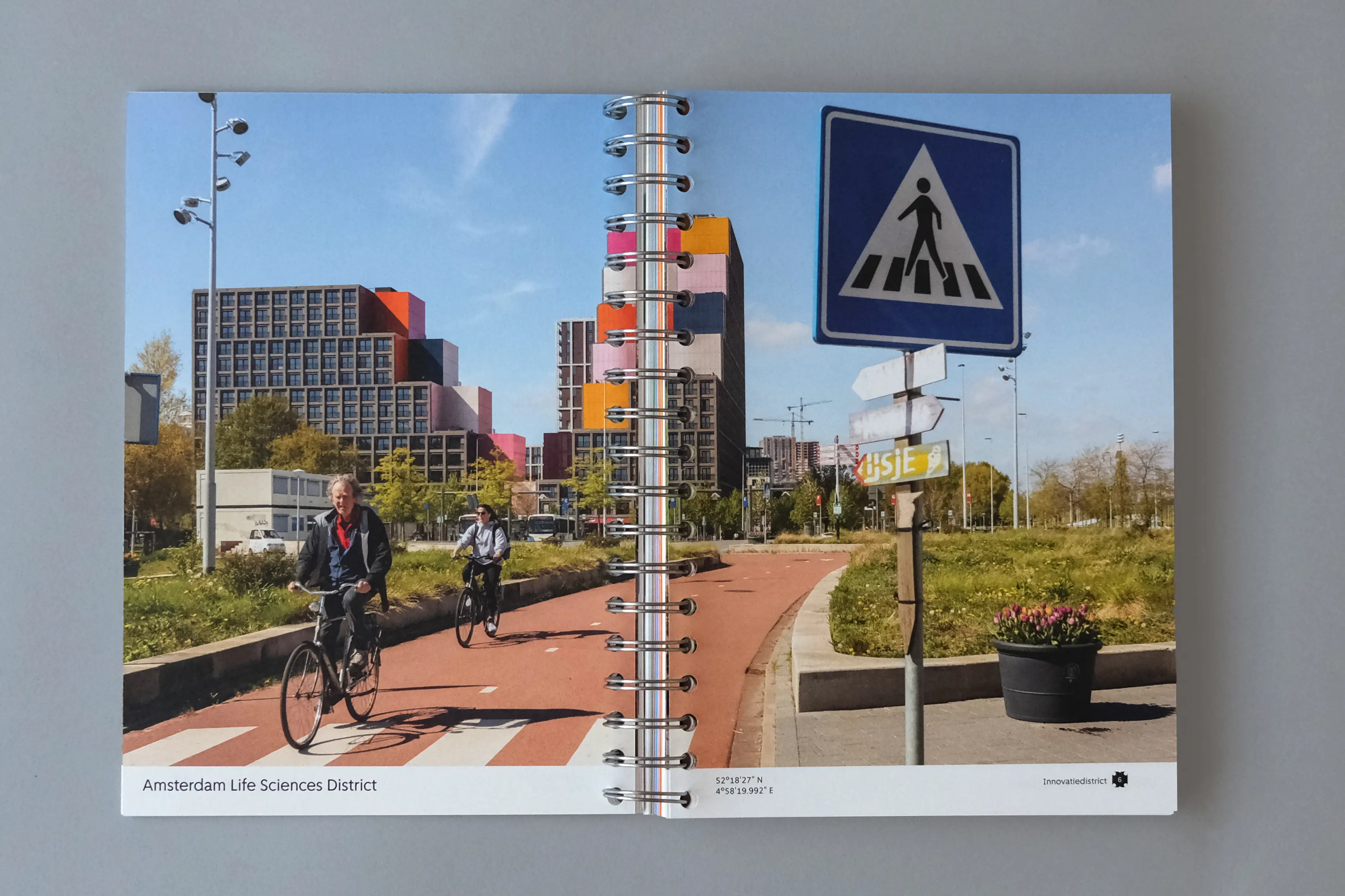
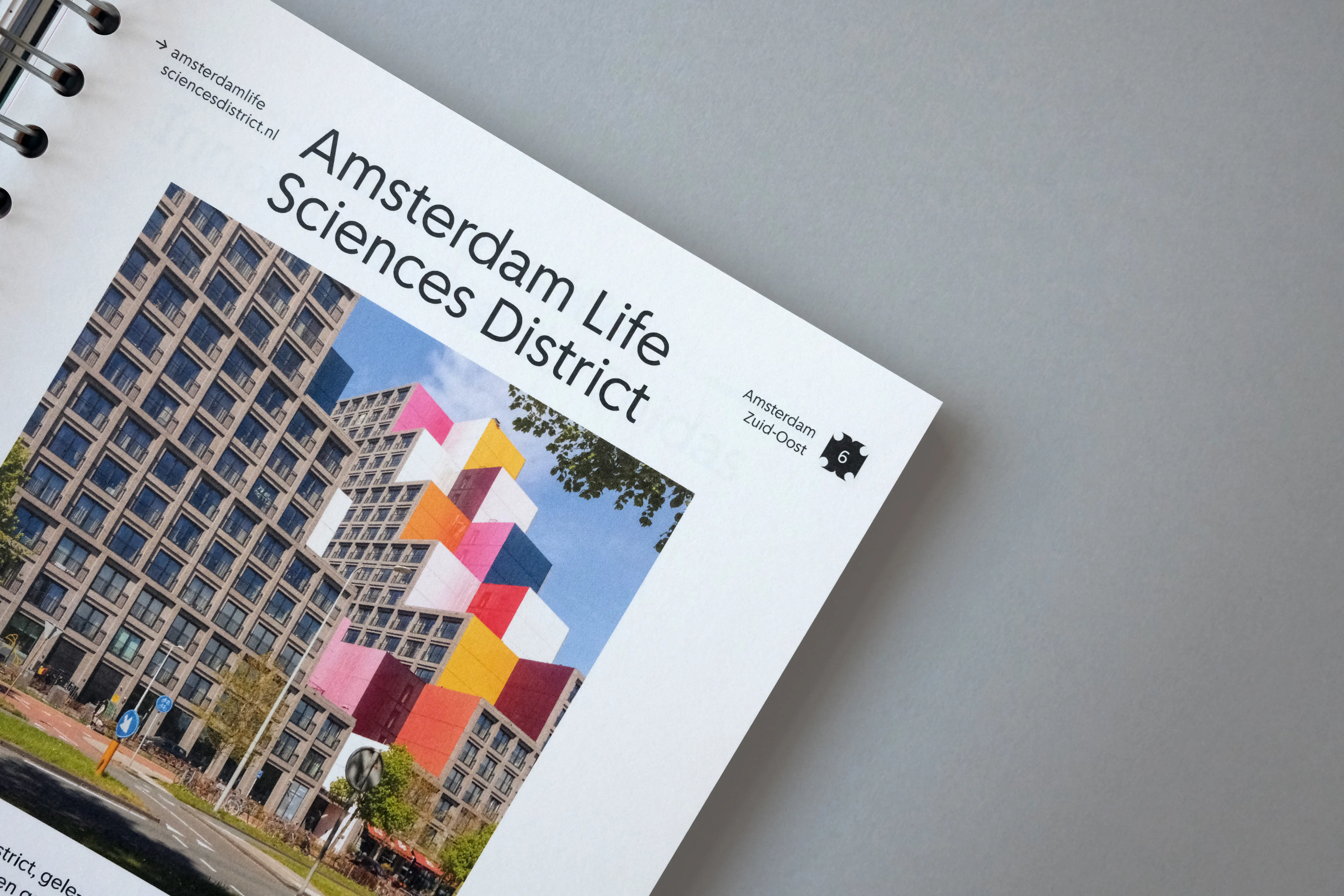
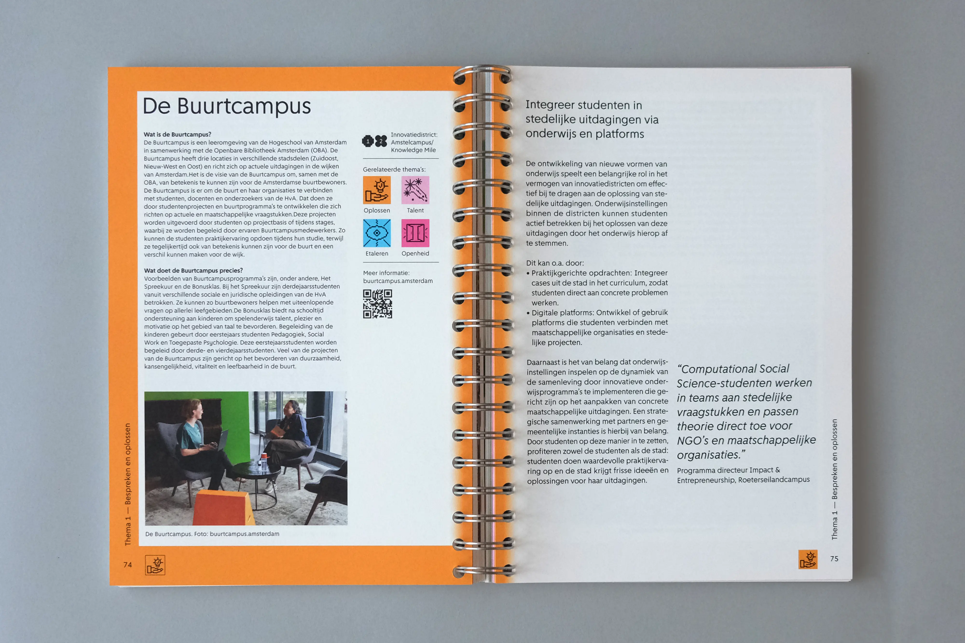
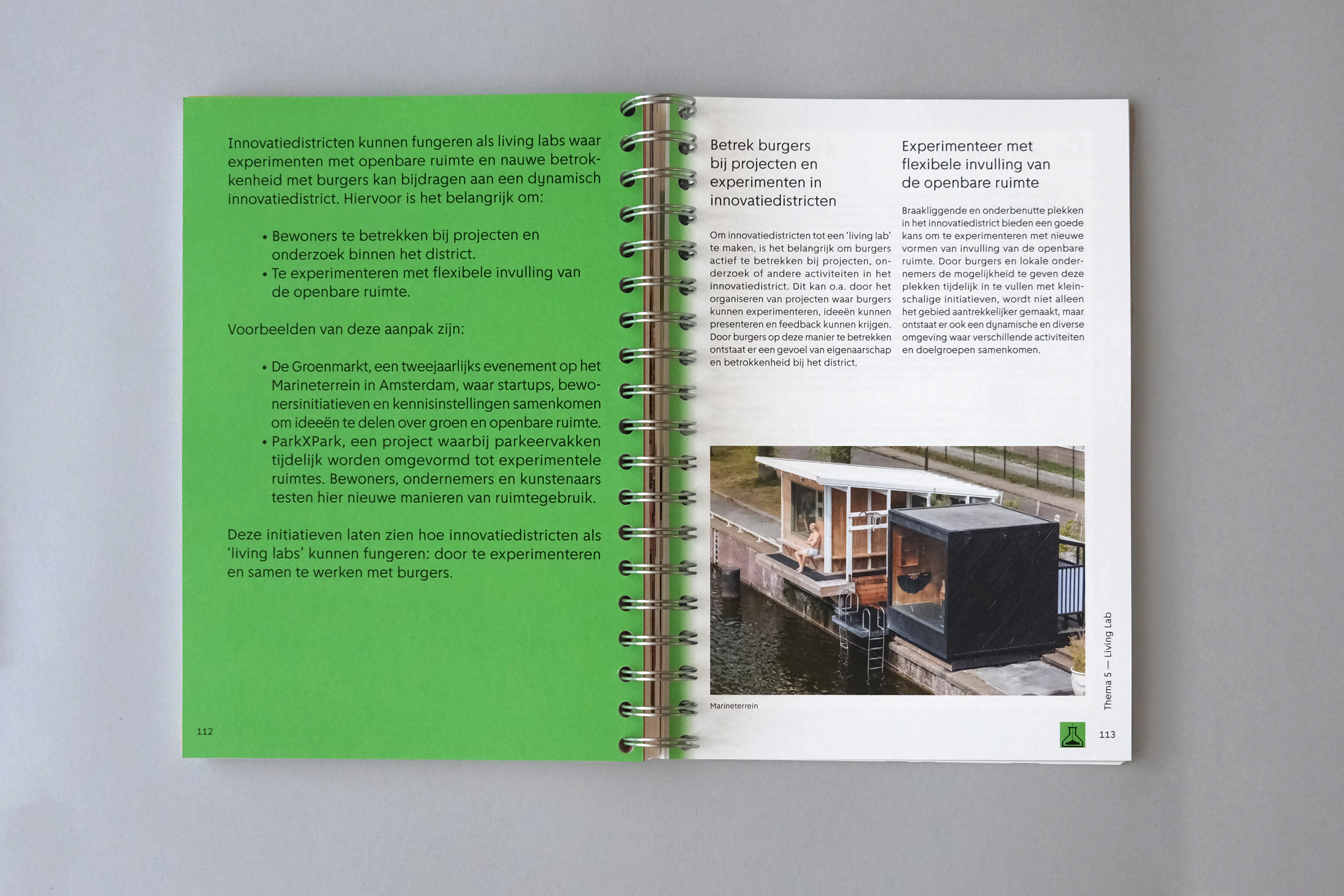
Since the districts of Amsterdam are central to our research, integrating photography was essential. We collaborated with the photographer Marlise Steeman for her documentary approach, attention to detail and ability to portray everyday life with honesty. Each district is first introduced with a full-spread photograph, and later revisited through a smaller image accompanied by brief contextual information. The two images reveal different perspectives: the first presents a wider view of the district and its inhabitants, while the second highlights an architectural detail or a more intimate aspect of the same place.