1. Research
The project was grounded in a scientific visual language, drawing specifically on microbiome imagery provided by our contact at AMEC. We also looked at similar websites to understand what worked well and where there was room to improve.
2. Concept
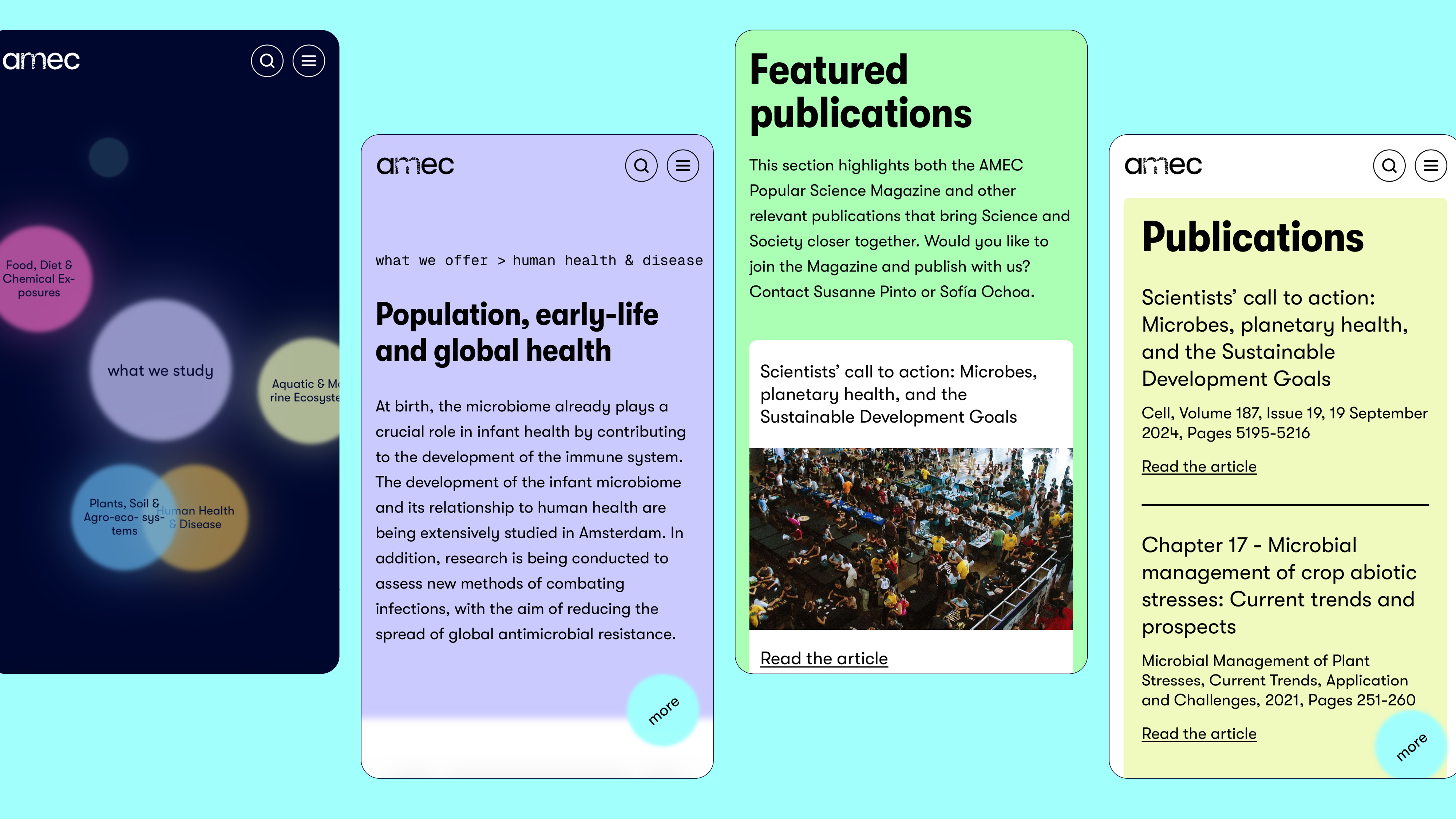
The concept centres on an interactive infographic on the landing page, which explains AMEC's structure and the microbiome fields one can study, alongside information on the collective's members and their respective research groups. This information design stays within reach on every page via a button in the bottom right corner. The rest of the website is built around it, organised into four main sections: what AMEC does, news & events, collaboration, and the team.
3. Design
The data visualisation was developed iteratively, with AMEC's team representatives involved throughout the process. It consists of coloured bubbles moving across the screen; hovering reveals text, and clicking opens deeper levels of information. The visualisation offers two viewpoints on AMEC: what they study and what they offer. Bubbles marked with a small arrow icon are clickable and lead to a page with full details. The bubble shape echoes the idea of the microbiome through a simplified, abstract form. Colours were sampled from the microbiome imagery and then expanded with additional hues at the same luminosity. From this information design, the rest of the website inherits its palette and its blurred borders, which recur throughout the coloured sections.
The logo's M is animated: it's made up of small bubbles that shift continuously between circular and pill-like shapes, generating an ever-changing variation of the letter.